Newsletter Subscribe
Enter your email address below and subscribe to our newsletter
Enter your email address below and subscribe to our newsletter
All voices matter
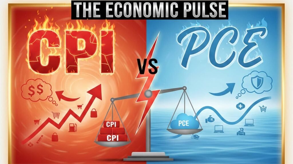
Inflation is one of those economic concepts that affects everyone—from everyday shoppers to policymakers at the Federal Reserve. But when it comes to tracking it, two key metrics often dominate the conversation: the Consumer Price Index (CPI) and the Personal Consumption Expenditures (PCE) price index. If you’ve ever wondered why the Fed seems to favor one over the other, or how these figures influence everything from interest rates to your grocery bill, you’re in the right place. In this guide, we’ll break down the differences between CPI and PCE, explore their strengths and weaknesses, and help you understand which one might matter more depending on your perspective—whether you’re an investor, economist, or just trying to make sense of rising costs.
I’ve spent years analyzing economic data as a financial analyst, and I’ve seen firsthand how these indexes can sway market decisions. Drawing from reliable sources like the Bureau of Labor Statistics (BLS) and the Bureau of Economic Analysis (BEA), along with insights from top economic think tanks, this article aims to clarify the nuances without overwhelming you with jargon. Let’s dive in.
The Consumer Price Index, or CPI, is probably the inflation measure you’ve heard about most often. Published monthly by the BLS, it tracks changes in the prices of a fixed basket of goods and services that urban consumers typically buy. Think of it as a snapshot of what it costs to maintain a certain standard of living in cities across the U.S.
CPI is calculated by surveying prices for around 80,000 items each month, covering categories like food, housing, apparel, transportation, medical care, and recreation. The “fixed basket” approach means the index assumes people buy the same things in the same proportions over time—say, always opting for ground beef instead of switching to chicken when beef prices spike. This method has its roots in post-World War II efforts to measure cost-of-living adjustments for workers, and it’s evolved to include sub-indexes like CPI-U (for urban consumers) and CPI-W (for wage earners).
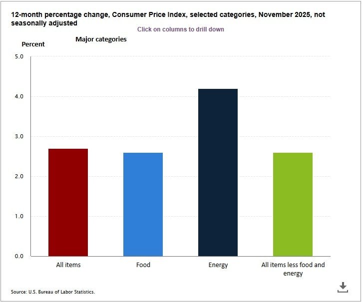
One thing that stands out about CPI is its sensitivity to volatile elements like food and energy prices. That’s why you’ll often see “core CPI,” which strips those out for a smoother view of underlying inflation trends. In practice, CPI directly impacts things like Social Security adjustments and tax brackets, making it a household name in economic news.
On the other hand, the Personal Consumption Expenditures price index, or PCE, comes from the BEA and is part of the broader national accounts that track GDP. Unlike CPI’s fixed basket, PCE is more dynamic—it accounts for how consumers actually shift their spending habits in response to price changes. For instance, if gas prices soar, people might drive less or switch to public transit, and PCE reflects that behavioral flexibility.
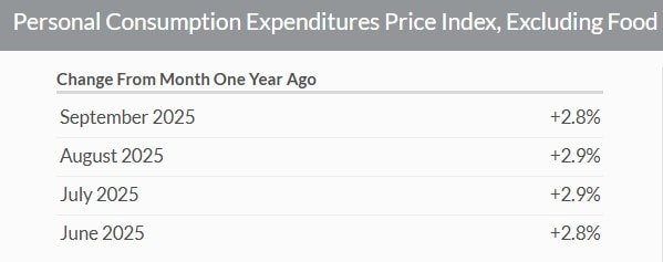
PCE draws data from business surveys rather than direct consumer price checks, covering a wider swath of expenditures, including those paid by employers (like health insurance) and government programs. It’s released monthly but often revised quarterly, giving a more comprehensive picture of the economy. The Fed has leaned on “core PCE” (excluding food and energy) as its primary inflation target since 2012, aiming for a 2% annual increase to signal healthy growth without overheating.
What makes PCE stand out is its lower weighting on housing costs compared to CPI—about 15% versus CPI’s 33%—which can make it less reactive to rent hikes or mortgage rate changes. This broader, adaptive approach often results in PCE showing slightly lower inflation rates than CPI, influencing monetary policy decisions.
While both CPI and PCE aim to measure inflation, their methodologies, scopes, and implications set them apart. To make this clearer, here’s a side-by-side comparison:
| Aspect | CPI (Consumer Price Index) | PCE (Personal Consumption Expenditures) |
|---|---|---|
| Issuing Agency | Bureau of Labor Statistics (BLS) | Bureau of Economic Analysis (BEA) |
| Data Source | Consumer surveys and price checks | Business surveys and national accounts |
| Basket Type | Fixed (assumes constant consumption patterns) | Flexible (adjusts for substitution effects) |
| Scope | Urban consumers (about 93% of U.S. population) | All personal consumption, including rural and institutional |
| Key Components | Heavy emphasis on housing (33%), food, energy | Broader coverage, less weight on housing (15%) |
| Volatility | Higher due to food/energy inclusion | Lower, more stable trends |
| Revisions | Minimal, mostly seasonal adjustments | Frequent quarterly updates |
| Primary Use | Cost-of-living adjustments, wage negotiations | Fed’s inflation target, GDP integration |
| Typical Reading | Often higher than PCE (e.g., 3.5% vs 2.8% in recent data) | Generally lower, reflecting behavioral shifts |
This table highlights why CPI might scream “inflation alert” during oil price spikes, while PCE offers a calmer, more holistic view. For example, in 2022, when energy costs surged due to global events, CPI peaked at over 9%, but PCE hovered around 7%—a difference that shaped the Fed’s rate-hike strategy.
Deciding between CPI and PCE isn’t about picking a winner; it’s about context. If you’re a retiree tracking Social Security COLAs or a union worker negotiating wages, CPI is your benchmark—it’s designed for that granular, consumer-focused lens. Investors and economists, however, often prefer PCE because it aligns better with overall economic health and the Fed’s playbook. The central bank has repeatedly emphasized PCE’s superiority in capturing substitution effects, which CPI overlooks, leading to what some call “formula bias” in CPI readings.
In my experience reviewing economic reports, PCE tends to be a more reliable predictor of long-term trends. Take the post-pandemic recovery: CPI overstated inflation pressures from supply chain snarls, prompting aggressive rate hikes, while PCE suggested a softer landing was possible. If you’re analyzing investments, watch PCE for clues on Fed moves—it could mean the difference between buying bonds too early or timing stock entries just right.
That said, neither is perfect. CPI can lag in reflecting new goods like streaming services, and PCE’s revisions can create uncertainty. For the best insights, cross-reference both with other data like producer prices or wage growth.
These indexes aren’t just numbers—they drive policy and pocketbooks. When CPI runs hot, it fuels headlines about “stagflation” and pushes for tighter budgets. PCE, being the Fed’s darling, directly informs decisions on interest rates, which ripple into mortgages, car loans, and business investments. Remember the 2023 banking jitters? They stemmed partly from misaligned inflation expectations between CPI’s volatility and PCE’s steadiness.
On a global scale, similar metrics exist—like the EU’s HICP or Japan’s CPI—but the U.S. duo underscores a key debate: Should inflation measures prioritize consumer pain or economic adaptability? As someone who’s advised on portfolio strategies during inflationary periods, I’d argue both are essential for a balanced view, especially in uncertain times like now, with supply chain shifts and geopolitical tensions.
In the end, understanding CPI vs PCE boils down to recognizing their roles in the bigger economic picture. CPI gives you the street-level feel of price pressures, while PCE offers a bird’s-eye view that’s crucial for policy. By keeping an eye on both, you’ll be better equipped to make informed decisions—whether adjusting your budget, planning investments, or simply staying ahead of the curve.
If you’re diving deeper, check out the BLS and BEA websites for raw data, or explore analyses from outlets like Brookings or the New York Fed. Inflation isn’t going away, but with the right tools, you can turn it from a headache into an opportunity. What’s your take—does one index resonate more with your financial reality? Share in the comments below.